Building a Bold and Energetic Brand Identity
As a new entrant, NutriBar needed a strong identity to cut through the crowded health and wellness market. Without a distinct look and feel, the brand risked blending in with countless similar snack products on store shelves. They needed visuals that would immediately capture attention and stay memorable in the consumer’s mind.
Most competitors either looked too clinical or overly busy. That makes it harder for audiences to connect emotionally. NutriBar wanted to strike the right balance. Professional enough to build trust, but also bold and approachable to gain curiosity. The challenge was to create a design system that stood out while remaining simple and clear
They required a cohesive system of visuals and guidelines to maintain brand consistency across packaging and communication. Without a unified identity, future campaigns risked feeling disjointed and unprofessional. Establishing a strong design language was key to building long-term recognition and credibility.
When Herbelle approached us, they faced three core challenges:
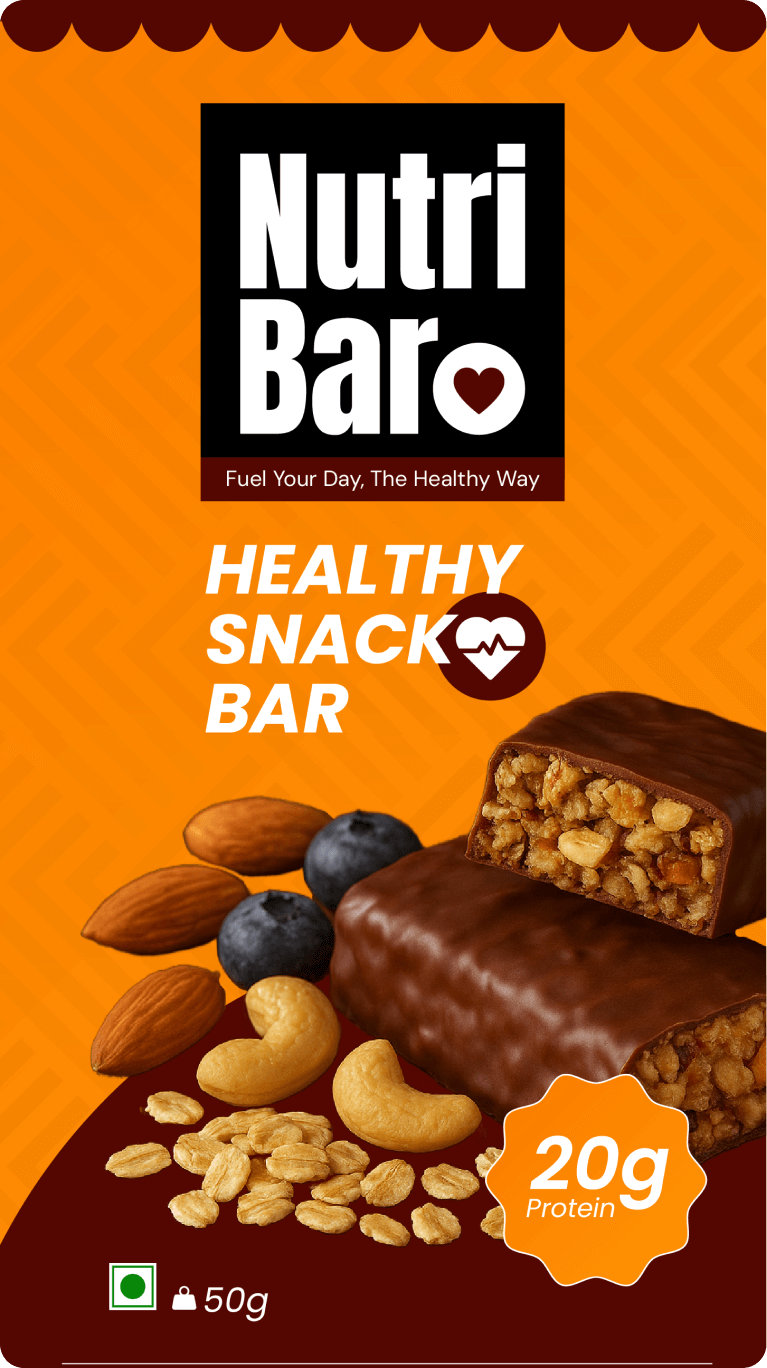
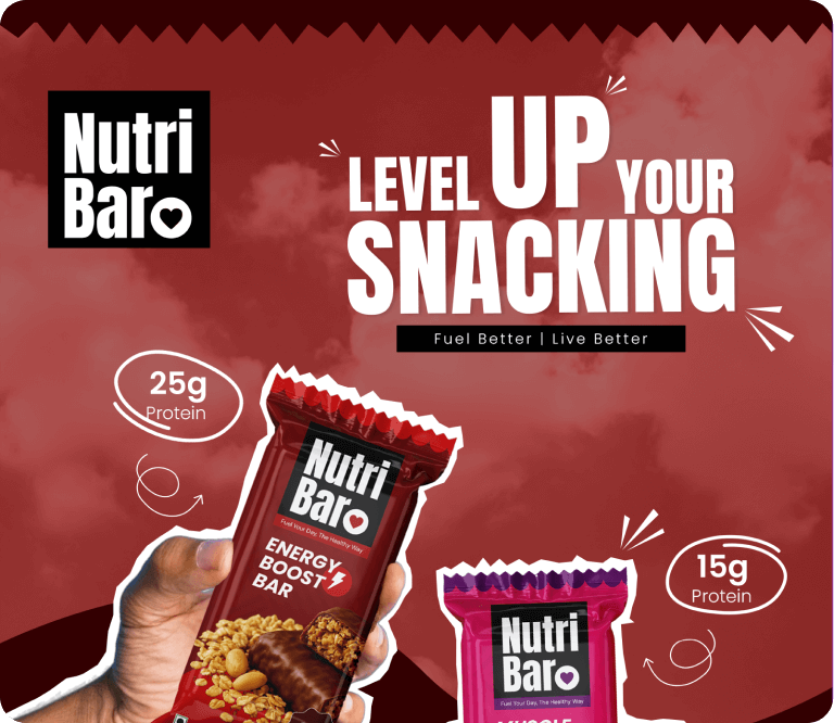
We designed a modern and bold logo with a human touch. By incorporating a heart motif, we connected the brand with health, energy, and care. The design works seamlessly across digital and physical platforms.
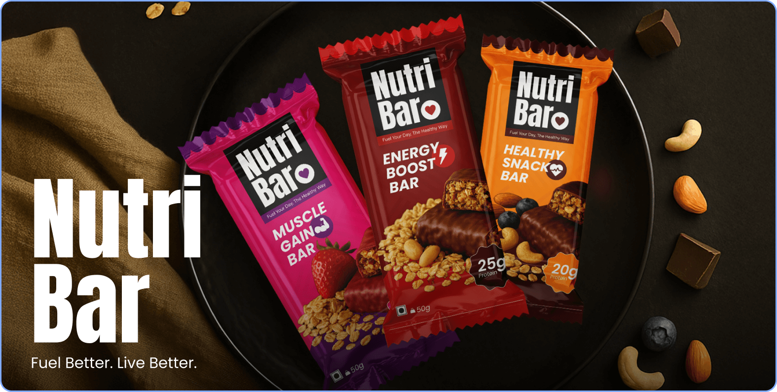
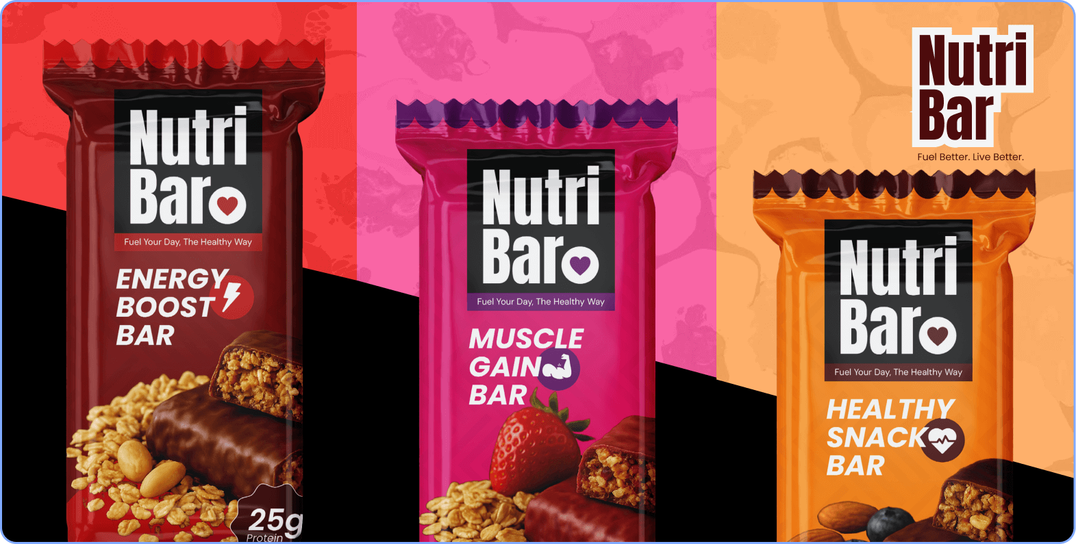
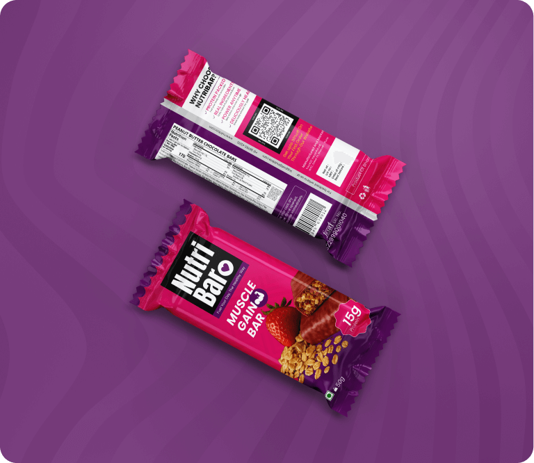
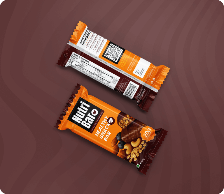
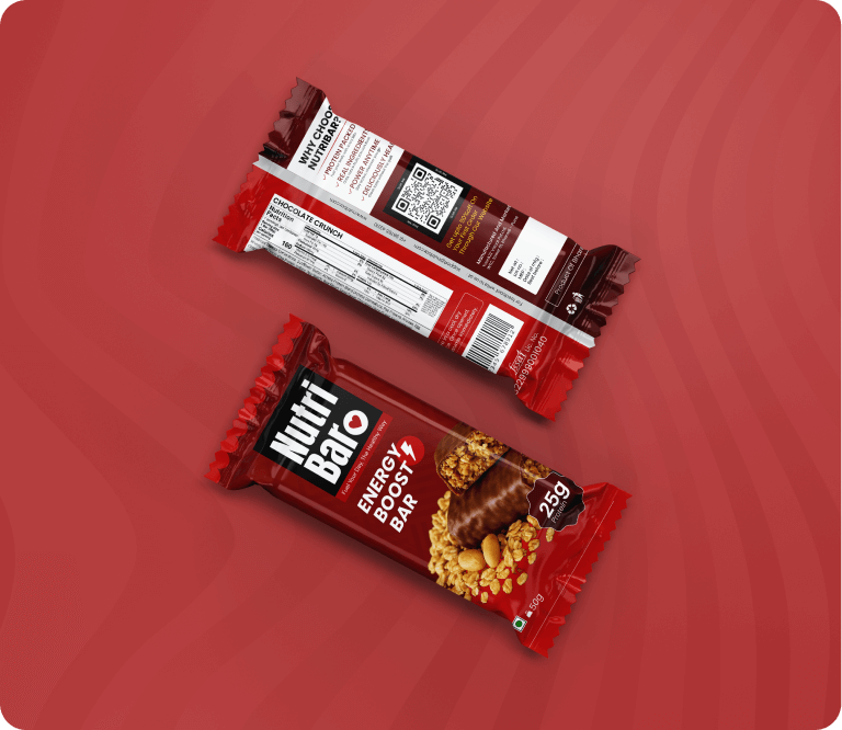
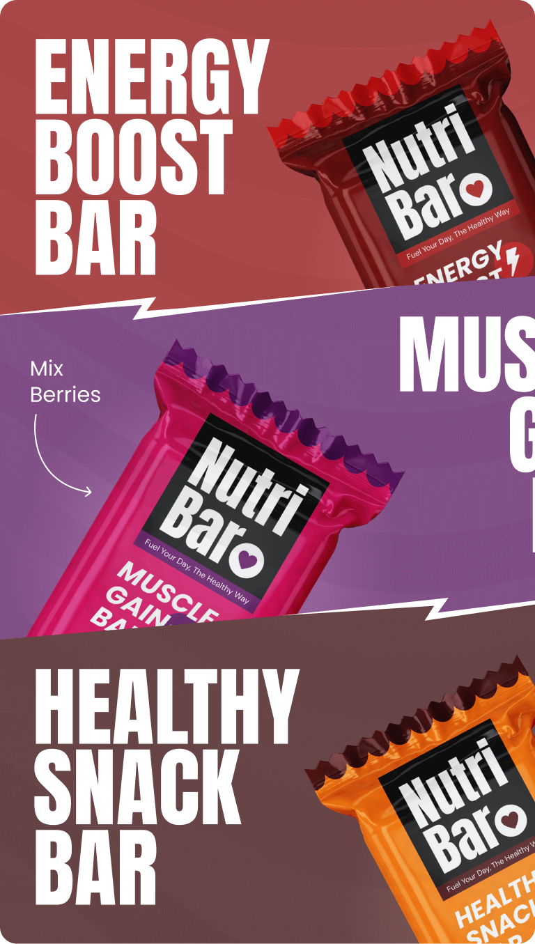
For the protein bars, we developed packaging that was minimal yet impactful. Each flavour carried its own unique colour, but the system ensured that the overall brand language was consistent and recognizable.
To ensure consistency, we created a comprehensive brand guideline that defined logo usage, typography, colour palettes, and tone of voice. This provided NutriBar with a clear roadmap for all future branding activities.
NutriBar successfully launched with a brand that looked confident, modern, and consumer-friendly. The packaging created strong shelf presence, the logo became an identifiable mark of trust, and the consistent visual system gave them a professional edge over competitors.
Follow Us
Follow Us
Follow Us
Follow Us
Follow Us
Follow Us
Follow Us
Follow Us
Follow Us
Follow Us
Follow Us
Follow Us