Creating a Bold Digital Identity for an IT Brand
Delivering sleek, functional UI/UX and email experiences for a tech-driven audience
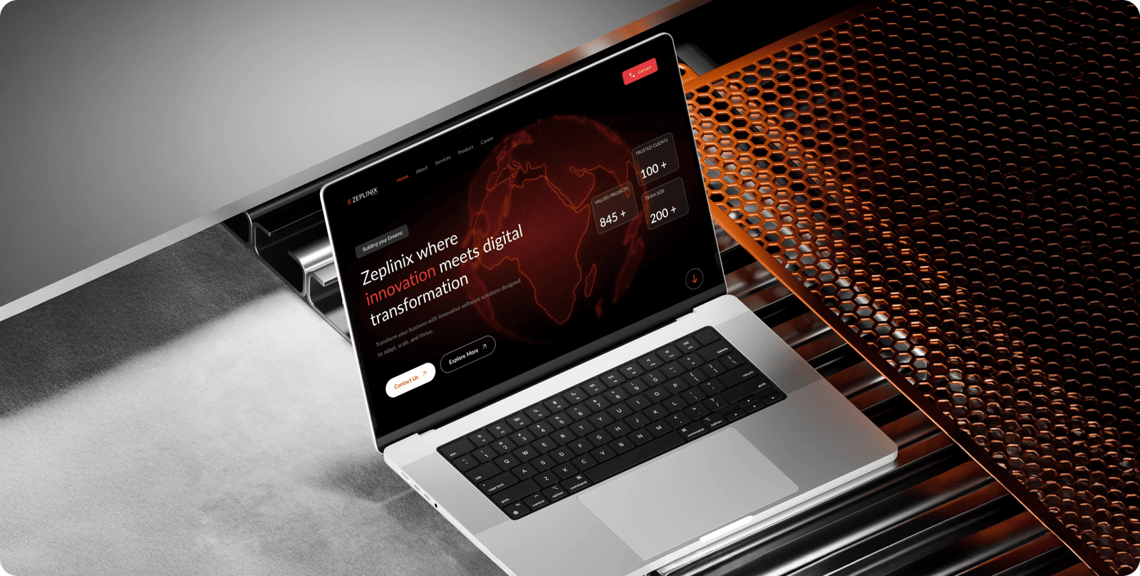
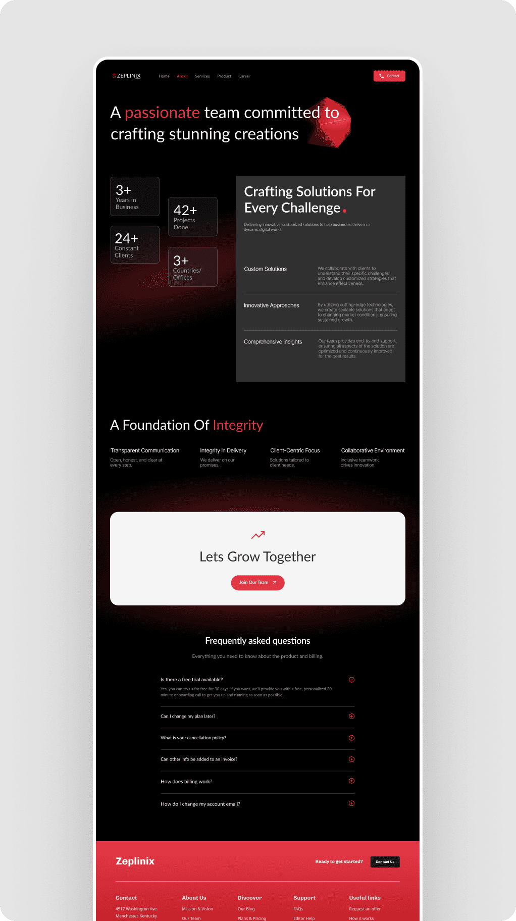
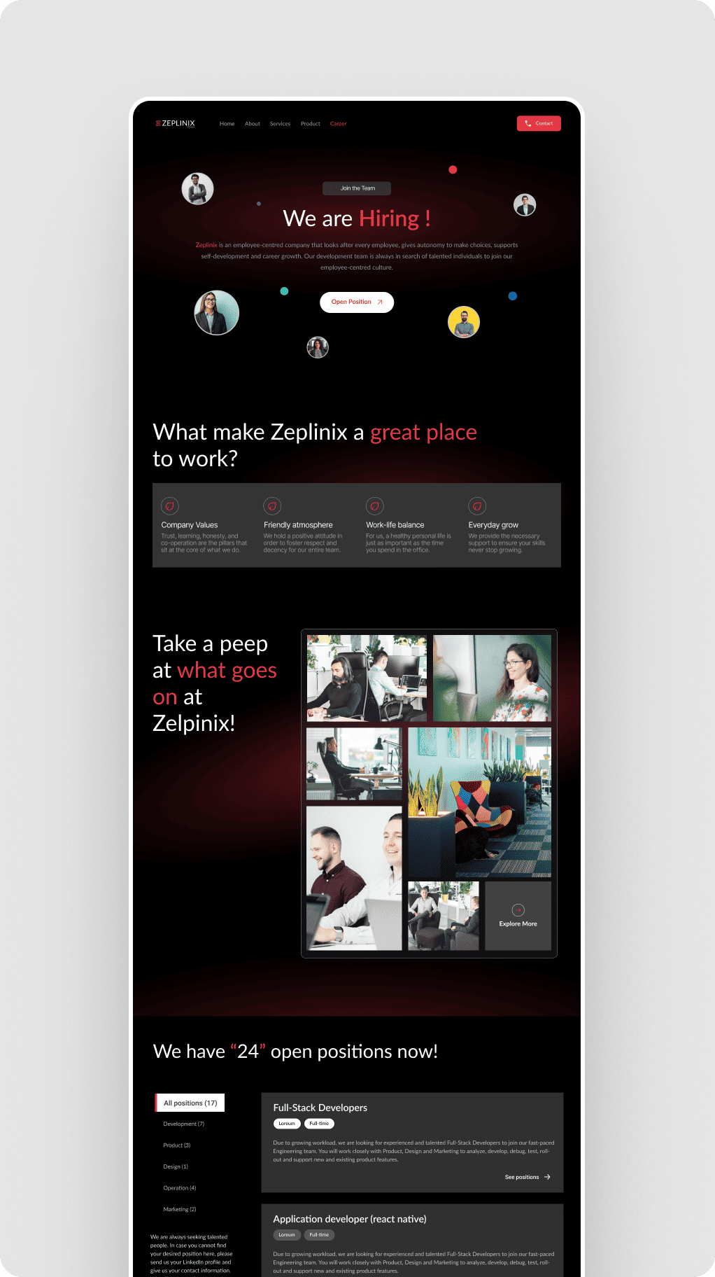
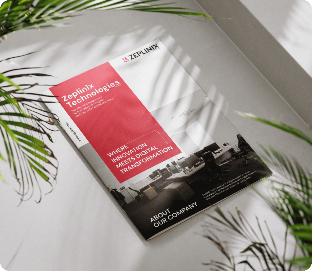
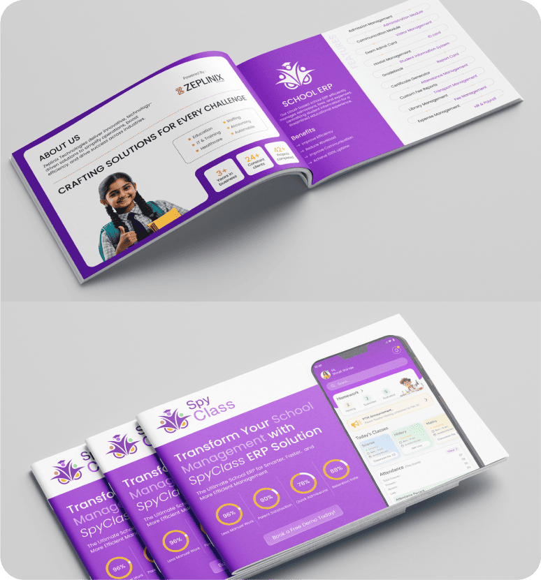
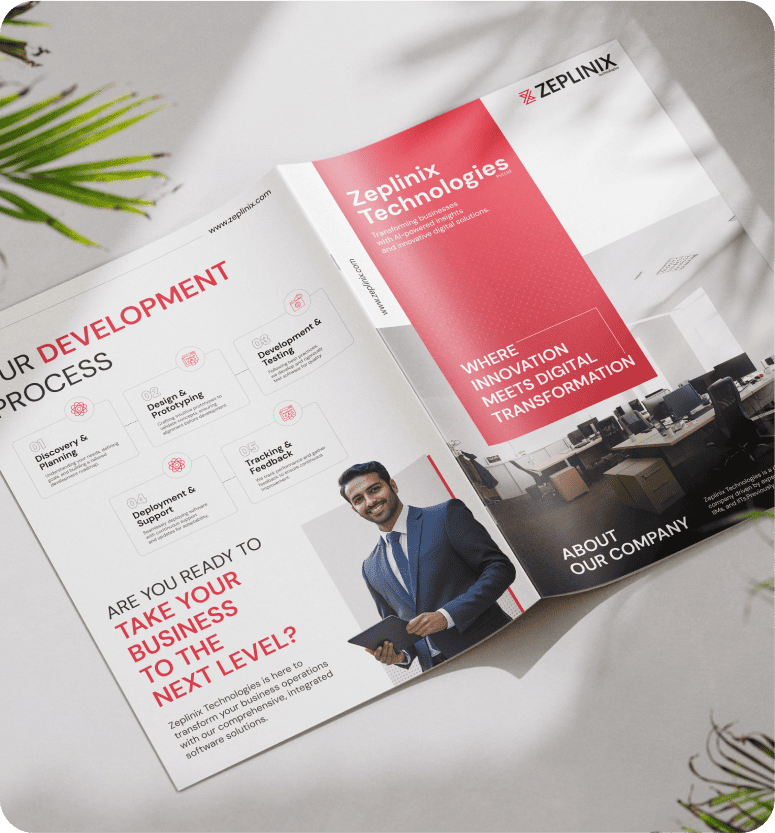
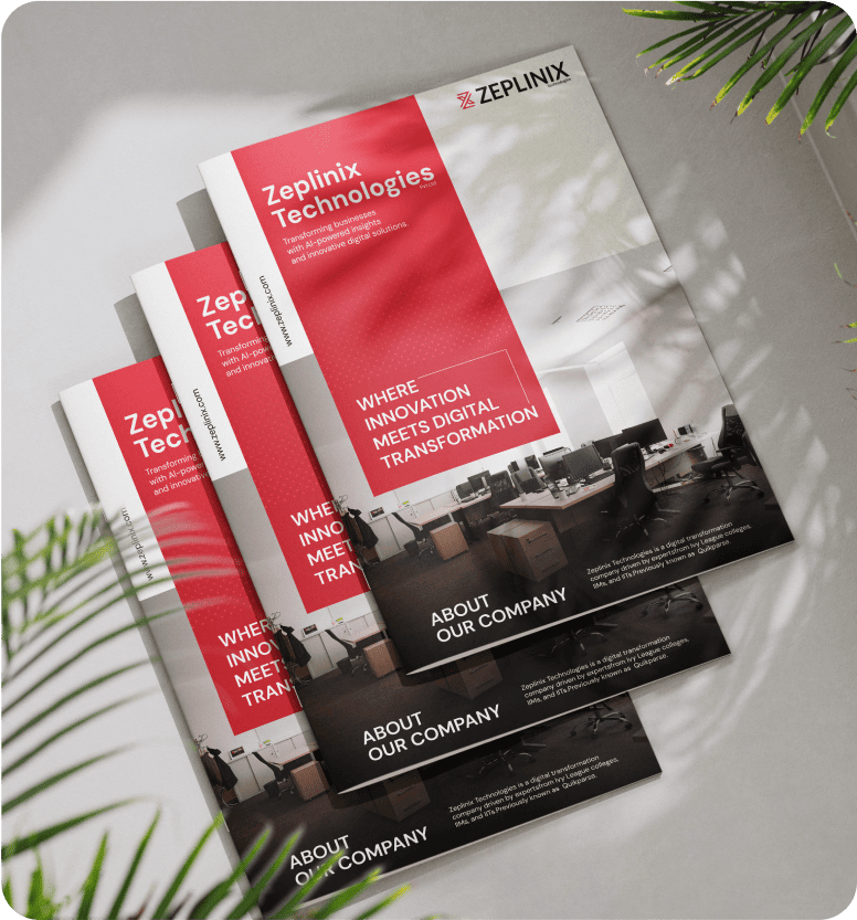
As a tech-focused company, Zeplinix required a digital presence that conveyed professionalism and credibility from the first click. In an industry where first impressions matter, their brand needed to look reliable and future-ready. The website had to reassure potential clients that Zeplinix could handle complex IT challenges with expertise.
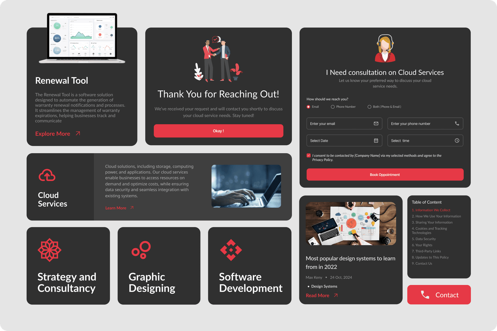
Their previous website lacked clarity and structure which made it difficult for visitors to navigate services and take action. Users often struggled to find relevant information quickly. This led to frustration and drop-offs. A streamlined, intuitive flow was essential to keep visitors engaged and moving toward conversions.
Email templates had to match the website’s look and feel while remaining functional across devices. Without consistency, brand recall would weaken, and important client communication could feel disconnected. The challenge was to balance aesthetic design with technical reliability across email platforms.
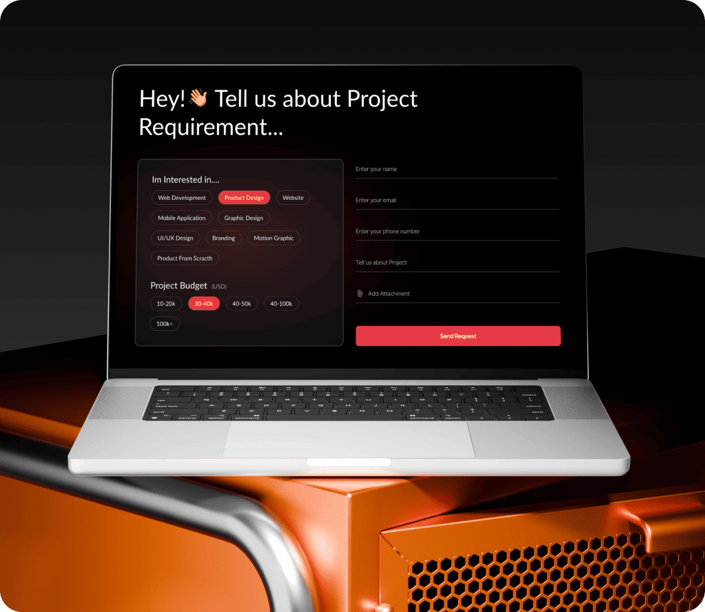
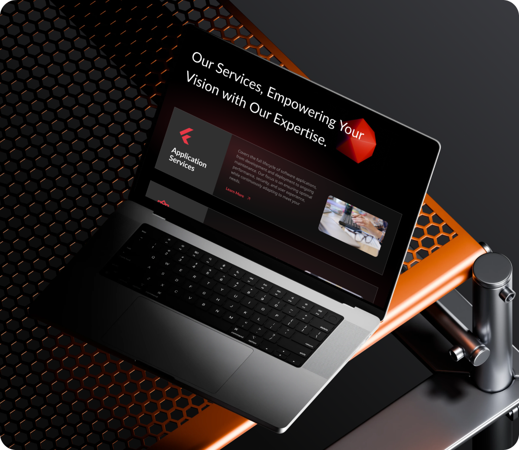
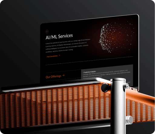
The client wanted engaging prototypes with animations and micro-interactions that felt modern yet easy to use. These interactions had to be smooth enough to delight users without compromising on speed or usability. The goal was to create a digital identity that felt lively, innovative, and distinctly Zeplinix.
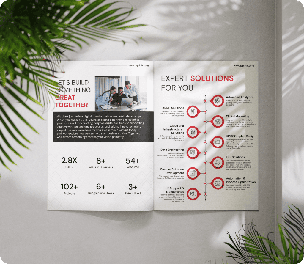
We studied user expectations in the IT service space and identified friction points in Zeplinix’s offerings. This gave us clarity on what to simplify, highlight, and improve. We also benchmarked against competitor sites to understand industry standards and gaps. The findings ensured that every design decision was grounded in real user needs, not assumptions.
We mapped user flows to ensure visitors could easily explore services, case studies, and contact options. The goal was to reduce clutter and guide users seamlessly toward key actions. Content blocks were arranged in a hierarchy that prioritized clarity and speed. This structured approach made complex offerings feel simple and approachable for first-time visitors.
We created multiple prototypes with interactive elements like hover states, smooth transitions, and animated icons to allow the client to visualize different directions and select the one that best matched their vision. Each prototype was tested internally to ensure smooth performance across devices. These interactive previews also made client feedback faster and more precise.
We conducted usability tests to validate the ease of navigation and interaction. We used client feedback to refine layouts, transitions, and CTAs before final deployment. Cross-browser and device testing ensured consistent performance everywhere. This step guaranteed the final product delivered both aesthetic impact and functional reliability.
Follow Us
Follow Us
Follow Us
Follow Us
Follow Us
Follow Us
Follow Us
Follow Us
Follow Us
Follow Us
Follow Us
Follow Us